The Club App Revamp Project
Design System for The Club Ecosystem
DURATION
October 2021 ~ Present
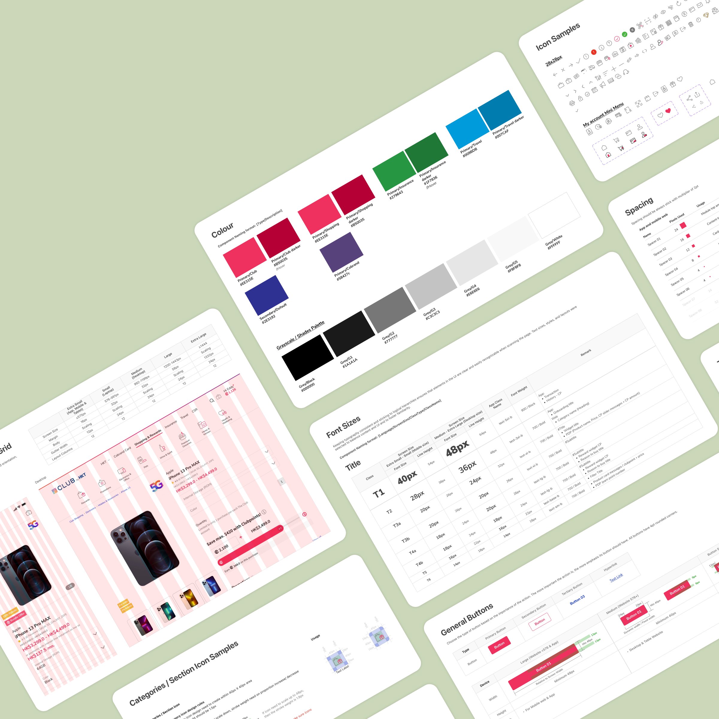
Due to relaunching The Club’s digital platforms, creating a design system for all digital touchpoints under The Club is an important task that should not be overlooked. This not only saves time and resources in development but also enhances the user experience by providing a unified and cohesive brand identity.
Moreover, a well-defined design system can help teams collaborate better and increase overall productivity. With The Club's large and diverse range of digital touchpoints, a design system can help manage these channels more efficiently and communicate a strong message to the users. Therefore, it is necessary and beneficial to create a design system for The Club.
ROLE
Research, define direction, UI design, mockup, validate, document, design management
TEAM
2 core designers, rest of design team
TOOL
Figma, Confluence
DESIGN PROCESS
This is the design process I followed for this project.
AUDIT & RESEARCH
Evaluate the current design system
First thing first, we have to understand the strengths and weaknesses of our existing design system by conducting a thorough assessment. Identify pain points, outdated components, and inconsistencies.
And we gathered feedbacks from designers, developers, and users to understand their experiences with the current design system and pinpoint areas for improvement.
AUDIT & RESEARCH
Competitive analysis
Research and benchmark against other industry-leading design systems to identify best practices and gain insights into the latest trends:
DESIGN
Colours
DESIGN
Typography
In the Club digital products we had to cater with English user, also Traditional Chinese user. In English font we chose Nunito Sans because geometric shape of the letters and the spacing between characters is perfect. It is also great to have a big contrast with Bold text, it might bring the message more prominent.
For Traditional Chinese to tend to select OS preferred fonts, such PingFang HK for iOS and Noto Sans TC for Android device, since the complexity of Chinese charters, it is more user friendly when looking on a familiar fonts.
DESIGN
In the Club design system we decide collaborate with agency to fully customise our icon set. We discover that majority icon set in the market can not fulfil our needs in a wide range of products. We focused on simplicity to help users understand the concept the icon represents and recognise icons on smaller screens.
Iconography
DESIGN
Buttons
In buttons, we prepare four stages of button status, Default, Pressed, Focus and Disable.
Also we know that Secondary button will be used in area like form or on Cancel button, so we cater in our design system.
DESIGN
Grid, Responsive & Spacing
The foundation of a design system is about spacing and grid system and responsive behaviour. With a minor changes with this properties they can make a huge difference in the look and feel of a design.
For this project, we used an 8pt grid system with a 12-column grid and an 8px baseline grid. And also used a rem-based guide for the spacing system that aligns with the 8px grid.
we chose an 8pt system to make the design system more responsive, as all top screen sizes are divisible by 8 on at least one axis. This is important because it helps prevent antialiasing.
DESIGN
The big category of components I built for the Club is product display widgets.
Also we know in ecommerce world there is a lot a price rule for a product, such we using “As low as“ for a config product, a config product is cluster of similar products (eg, iPhone 12 Pro with different colour & storage). We using tags that label out the product selling point, such how much % of rebate and if it is a Pre-order products
Product display widgets
Our challenge: In the Club, users can pay not only by cash, can also with Club Points, in the product card also will display price mix with cash&points, so we need to cater both scenarios.
DESIGN
Design systems are complex and I've only scratched the surface of components in here. To round this out I just wanted to show a few of the other components that we have done so far to help the Club define design system to secure our app and even our products tone and identity.
More components…

VALIDATE
To ensure that all team members and stakeholders were well-informed about the progress of the revamping process, we established various communication channels. We also reached out to other stakeholders, such as business partners and customers, to keep them informed of the changes and to gather their feedback.
To ensure the usability of the design system, we conducted two rounds of usability tests with real users. These tests were crucial in gathering valuable feedback and insights that we used to refine and improve the design system even further. This ensured that the final product was not only functional and aesthetically pleasing but was also highly user-friendly and intuitive.
Communication and Testing
IMPLEMENT & DOCUMENT
We document design system in a comprehensive style guide or documentation. Which covered all aspects of the design system, including the visual elements, UI components, interaction patterns, accessibility guidelines, and design best practices
Develop design guidelines
IMPLEMENT & DOCUMENT
Develop design guidelines
We document design system in a comprehensive style guide or documentation. Which covered all aspects of the design system, including the visual elements, UI components, interaction patterns, accessibility guidelines, and design best practices
RESULT
It’s not the end
Design system is not a one-time creation; it requires continuous iteration and improvement. Gather feedback from designers, developers, and users to identify areas for enhancement. Keep track of changes and updates to ensure the design system stays up-to-date.


